
Homepage Essentials Every Service Business Should Have
A practical checklist to help you turn your website from a digital brochure into a lead-generating tool.
WEBSITE DEVELOPMENTSMESCHECKLIST
Your homepage has one job: to convince someone who has never heard of you that your business is worth their time. That is harder than it sounds, and most service business websites fail at it without realizing it.
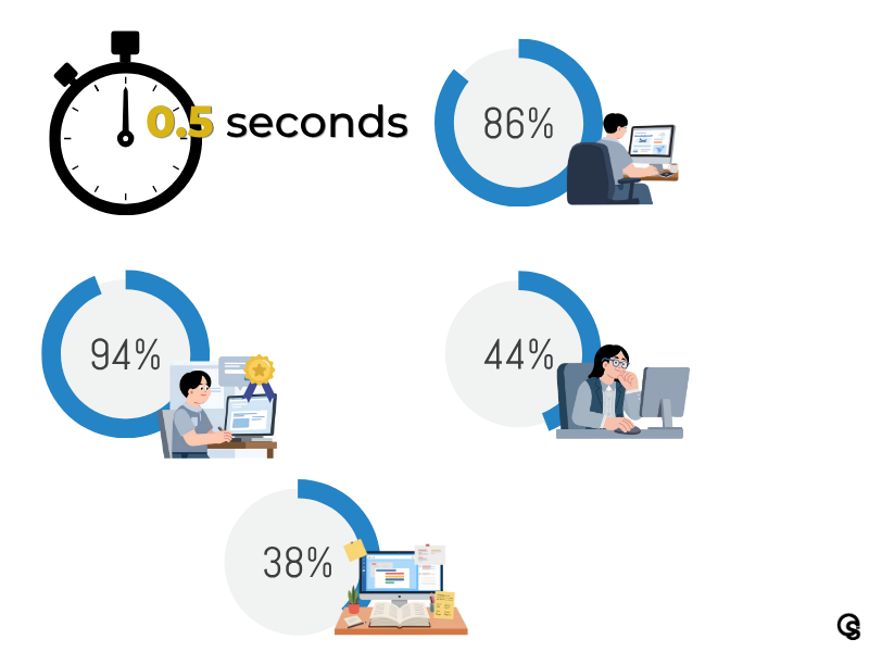
Research from Google shows that users form a first impression of a website in just half a second. At that moment, visitors are not reading your content or evaluating your credentials. They are deciding whether to stay or leave based purely on what they see and how the page feels. According to Bloggingwizard, 86% of visitors want to find product and service information directly on the homepage, and design research consistently shows that 94% of first impressions are influenced by design quality alone.
For service businesses, the homepage is not a formality. It is the first conversation you have with a potential client, often before they have spoken to anyone at your company. What that page says, shows, and asks visitors to do next determines whether they become a lead or a lost opportunity.
This checklist covers the ten homepage essentials every service business needs in place. For each item, you will find a clear explanation of what it is, why it matters, and what it looks like when done well. At the end, there is a section on what happens after the checklist, because knowing what to fix and actually fixing it are two different things.
The Homepage Essentials Checklist
Work through each item and assess your current homepage honestly. Partial or unclear implementations count as incomplete.
A clear headline that explains what you do and who you serve
Your headline is the first thing a visitor reads. It needs to answer one question in plain language: what does this business do, and is it relevant to me? Generic headlines like 'Welcome to our website' or 'We help businesses grow' communicate nothing useful. A strong headline names your service, your audience, and ideally a specific outcome. For example: 'Digital marketing services for service businesses ready to grow online.' Clarity beats cleverness every time.
A subheadline that adds context and credibility
The subheadline sits just below the main headline and fills in the detail your headline could not. This is where you explain your approach, mention a differentiator, or give the visitor a reason to keep reading. Keep it short (one to two sentences) and specific. Vague language like 'your trusted partner in growth' wastes valuable space. Use it to say something that matters to your ideal client.
A primary call to action above the fold
A call to action (CTA) is a button or link that guides visitors toward the next step. Without one, people who are interested in your services have no obvious path forward. Your primary CTA should be visible without scrolling, use action-oriented language ('Book a discovery call,' 'Get a free audit,' 'See how we work'), and link to a specific destination rather than a general contact page. Avoid vague CTAs like 'Learn more' without context.
A services overview section
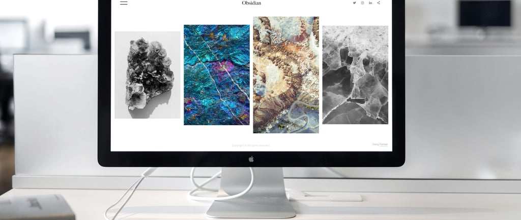
Visitors need to understand what you offer quickly, without clicking through multiple pages. A homepage services section does not need to be exhaustive. List your core service areas with a brief description of each and a link to the full service page. Write from the client's perspective: focus on what the service does for them, not just what it is technically called. For a digital marketing agency, this might include branding, website and SEO, social media, paid ads, and analytics.
Social proof: testimonials, reviews, or client results
Social proof is any evidence that other people have trusted your business and benefited from it. For service businesses, this is one of the most persuasive things a homepage can carry. It can take the form of written testimonials with the client's name and business, Google star ratings, logos of companies you have worked with, or brief results ('Helped a retail client increase organic traffic by 60% in six months'). First Page Sage identifies missing trust validation as one of the most common reasons B2B websites underperform on conversion.
Clear and accessible contact information
This sounds obvious, but 44% of B2B buyers leave a website when they cannot find contact information. At minimum, your homepage should show an email address or contact form, a phone number if relevant to your model, and a clear indication of how people can reach you. Do not bury this at the very bottom in small gray text. Make it easy to find, because friction at this stage means lost enquiries.
A brief about or trust-building section
People buy from businesses they trust, especially for service work where the quality of the relationship matters as much as the output. A short about section on the homepage humanizes your business and gives visitors a sense of who they would be working with. Include your approach, your experience, or the values that shape how you work. For remote-first or globally capable teams, this is also the place to address the 'where are you based and do you work with businesses like mine' question directly.
Mobile-responsive design
More than 60% of all global web traffic now comes from mobile devices. If your homepage does not adapt correctly to smaller screens, you are effectively making your site difficult for the majority of your visitors. Mobile responsiveness affects how your site ranks in Google, how long visitors stay, and whether they take any action at all. A properly responsive design adjusts layouts, font sizes, image dimensions, and button sizes automatically so the experience is clean and usable on any screen.
Fast loading speed
53% of mobile site visits are abandoned when a page takes more than three seconds to load. Every additional second of delay reduces conversions by approximately 7%. A slow homepage costs you leads quietly and consistently every single day. Speed is also a direct Google ranking factor, meaning a slow site is penalized before a visitor even arrives. Common culprits include oversized images, bloated page code, and low-quality hosting. All of them are fixable.
A simple and intuitive navigation structure
Navigation is the map of your website. If visitors cannot find what they are looking for within two or three clicks, most will leave rather than search further. Research suggests that limiting main menu items to five to seven options reduces cognitive load and keeps visitors focused. For a service business, your main navigation should cover: Home, Services (or individual service pages), About, Blog or Resources (if applicable), and Contact. Labels should be clear and descriptive, not clever or ambiguous.
Why Knowing the Checklist Is Not Enough
Reading this list and identifying what your homepage needs is a useful starting point. Many business owners can spot the obvious gaps: a missing contact number, a CTA that blends into the background, a services section that requires three clicks to find.
Where the challenge begins is implementation. Each of the ten elements above involves decisions that compound on each other. The headline you write affects how the CTA should be framed. The services section depends on how your navigation is structured. Your mobile layout determines whether your social proof is readable on the devices most of your visitors actually use. These are not isolated fixes. They are parts of a connected system.
There is also the question of what comes after the checklist. A homepage that checks all ten boxes but loads in six seconds, lacks proper metadata and title tags, or does not connect to a broader content and SEO strategy will still underperform. HubSpot's State of Marketing Report consistently identifies website, blog, and SEO as the top ROI-generating channel for B2B brands. The homepage is the front door, but the structure behind it determines whether visitors become enquiries.
This is the gap between a website that looks right and a website that works. The first is a design exercise. The second is a strategy exercise.
A note on DIY website builders
Tools like Wix, Squarespace, and WordPress have made it easier than ever to build a website without technical skills. For a first online presence, they can be a reasonable starting point.
The risk is mistaking 'built' for 'working.' A website that exists is not the same as a website that converts. Builder templates are designed to look clean, not to reflect your specific business, audience, or competitive positioning. They give you a structure but not a strategy.
If your homepage lives on a builder platform and you are not confident it is performing, that is exactly the kind of question a professional audit can answer quickly.
A Quick Self-Audit: How Does Your Homepage Score?
Before reaching out to a professional team, it helps to know where your biggest gaps are. Run through the ten checklist items above and ask yourself:
Can a first-time visitor understand what you do within five seconds of arriving on the page?
Is there a button or link that clearly tells visitors what to do next?
Can someone find your contact information without scrolling to the very bottom of the page?
Does the page load in under three seconds on a mobile phone?
Is there any evidence on the page that other clients have worked with you and been satisfied?
Does the navigation make sense to someone visiting your site for the first time?
If you answered 'no' or 'not sure' to more than two of those questions, your homepage is likely costing you leads. Not dramatically or obviously, but consistently, every day that visitors arrive and leave without taking action.
Not sure how your homepage is performing?
At Impasto Creative Solutions, we review websites the same way a potential client would: looking for clarity, trust signals, and clear next steps. We can tell you quickly what is working, what is missing, and what a strategic homepage built around your services and audience actually looks like.
Get in touch with impastocreatives.com and let us take a look at what your homepage is communicating right now.
Sources
1. Google Research. (2022). The Role of Visual Complexity and Prototypicality for First Impressions of Websites. Users form impressions in approximately 50 milliseconds. Reported via Diviflash, 2026. diviflash.com
2. Bloggingwizard / Diviflash. (2026). 75 Important Website Statistics Everyone Should Know. 86% of visitors want to find service details directly on the homepage. diviflash.com
3. Adobe. (Reported via Marketing LTB, 2025). Small Business Website Statistics 2025. 94% of first impressions are influenced by website design quality. marketingltb.com
4. Nielsen Norman Group. (2025). Visual Hierarchy and Conversion. Websites with clear visual hierarchy generate 38% more conversions. Reported via OMM Digital Solution. ommdigitalsolution.com
5. Marketing LTB. (2025). Small Business Website Statistics 2025: 92+ Stats. Approximately 44% of B2B buyers leave a website when they find no contact information. marketingltb.com
6. Google / Hobo Web / Network Solutions. (2025). Mobile Site Load Time Data. 53% of mobile visits are abandoned when pages take more than 3 seconds to load. networksolutions.com
7. OMM Digital Solution. (2026). How to Build a High-Converting Business Website in 2026. Every 1-second delay in page load time reduces conversions by 7%. ommdigitalsolution.com
8. Statista. (2025). Share of mobile website traffic worldwide. More than 60% of global web traffic originates from mobile devices. statista.com
9. First Page Sage. (2025). B2B Conversion Rates by Industry. Missing trust validation elements are a common reason for low B2B website conversion. firstpagesage.com
10. HubSpot. (2025). State of Marketing Report 2024/2025. Website, blog, and SEO ranked as the top ROI-generating channel for B2B brands in 2024 and 2025. hubspot.com
11. Impasto Creative Solutions. (2026). Keyword Cluster Research: 26 Clusters for Digital Marketing for Small Businesses. Internal document.
12. Impasto Creative Solutions. (2026). Blog Content Plan: Comprehensive Topic List. Internal document.


Why Your Homepage Matters More Than You Think
the time users take to form a first impression of your website
of visitors want to find service details directly on the homepage
of first impressions are shaped by website design quality
of B2B buyers leave a website when they cannot find contact information
more conversions come from websites with a clear visual hierarchy
IMPASTO CREATIVE SOLUTIONS
We make your brand visible, searchable, and impossible to ignore. Let’s get started today.